01Outcome
A rebrand that ships on every surface
Stock-vector comic no more — ninjaneers.de finally reads like the software company behind it, with one coherent system from the first marketing screen through every place the brand shows up.
Brand identity · 2025
From stock-vector comic to a credible software brand — rebuilt in-house when an external rebrand stalled, then shipped everywhere the mark appears.
End-to-end rebrand for Ninjaneers GmbH — brought in-house when an external engagement stalled, evolved from stock-vector comic to flat bento system, and shipped everywhere the mark appears.
01Outcome
Stock-vector comic no more — ninjaneers.de finally reads like the software company behind it, with one coherent system from the first marketing screen through every place the brand shows up.
02Empathy
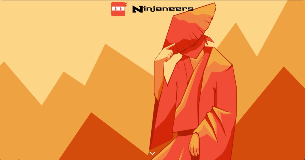
Ninjaneers' old identity was never deeply considered. The logo came from a stock vector library. The hero put a ninja silhouette on a literal red sun. The overall look felt closer to a Japanese comic than a B2B software company — charming, but not what potential customers or future employees needed to see.
After a year of expensive, unsuccessful work with an external designer, nothing had changed. There were no usage rules; every touchpoint looked slightly different. The company was growing, and the brand was holding it back.
The ninja spirit had traction with the team. The visual execution did not.
The old site made that gap obvious — disconnected screens with no path through what Ninjaneers actually does. The rebrand had to land as one live experience on ninjaneers.de, not another collection of pages.
The old site hero gave way to ninjaneers.de as one connected marketing experience.
03Research & process
Management brought the rebrand in-house. I owned the full reimagining — working weekly with the company owners, a project manager, and a design student I was mentoring through logo exploration and critique.
We tested bold directions first: 3D animations, origami-inspired marks, completely new concepts. In the end I stepped back from revolution toward evolution — keep what worked, sharpen what did not, and leave behind what held the brand back.
The direction that stuck combined flat, minimal design with modern bento-style layout — a nod to eastern composition that fits Ninjaneers' Japanese roots — paired with fluid animations and transitions. We iterated in Figma until the system felt confident enough to ship.
The stock mark was only the beginning. We pushed through bolder directions first, then narrowed toward something that could scale and still feel like Ninjaneers.
What emerged was a mark that reads as modern IT, not comic art — a refined ninja head paired with a customised Dongle font wordmark, without dots on i and j. Scroll through the steps below.

Original identity
Scroll to explore the evolution
Midway through the site work, icon-led culture blocks looked like a smart shortcut — quick facts about who Ninjaneers is, without another wall of copy.
They fought the bento system in review and felt too illustrative next to everything else. We scrapped them and kept cleaner, text-led modules instead.
A direction we tried and dropped — the icons never felt at home in the bento system.
04Solution
With the mark settling, the work turned to the system around it — how the brand should look, read, and behave on every surface.
Then came the site itself, rebuilt screen by screen, and finally the touchpoints beyond the browser where people actually meet the brand.

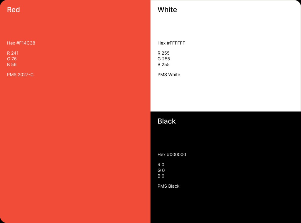
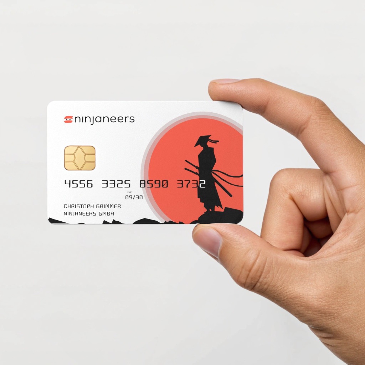
Even with a final logo, every deck and social post still used a slightly different red. There was no shared language for colour, type, or how the mark should sit on a slide or a profile photo.
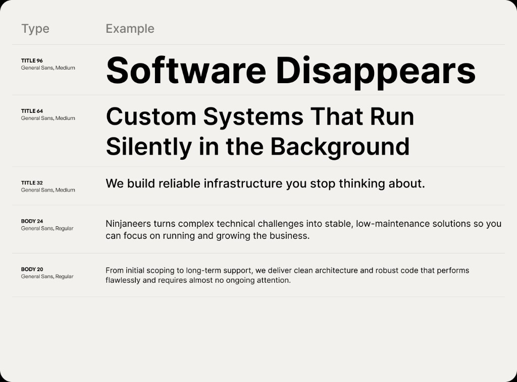
So we gave the brand a shared voice: customised Dongle font reserved for the wordmark alone, General Sans carrying everything else, and three quiet colours that do nearly all the work. The logomark lets the ninja head travel into favicons and avatars on its own; the lockups below show how both settle naturally on any surface.
The lockup pairs the ninja head with customised Dongle; the logomark below travels to favicons and avatars on its own.
Red, white, and black — high contrast, minimal saturation. Three colours cover most of what the brand needs.
General Sans carries headlines, body, and UI. Dongle appears only in the logo; hierarchy is size, weight, and spacing.
The old site still opened with comic-book hero art — memorable, but wrong for a software company asking for trust on the first scroll.
The new hero leads with a clear value proposition, restrained illustration, and a direct path to contact.
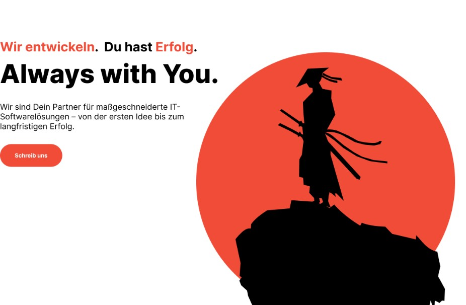
Hero — clear proposition, restrained illustration, direct contact.
Further down the page, visitors still could not answer a simple question: what is a Ninjaneer?
Philosophy cards now tell the ninja–engineer story in a scannable bento grid — one wide card up top, two supporting cards below.
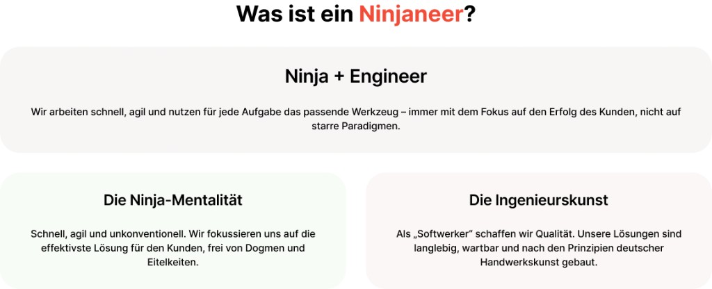
Philosophy — the ninja–engineer story, scannable in three cards.
Services had lived in a long, flat list — capabilities without hierarchy, hard to scan in a hurry.
A six-card grid gives each offering its own module: tech tags, bullet lists, and a closing CTA.
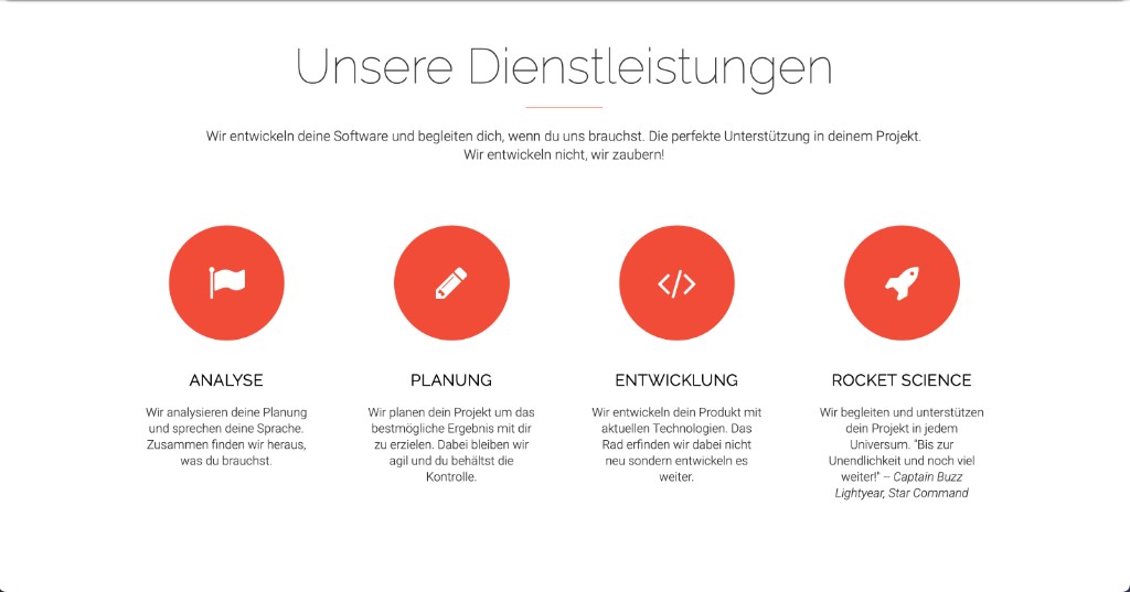
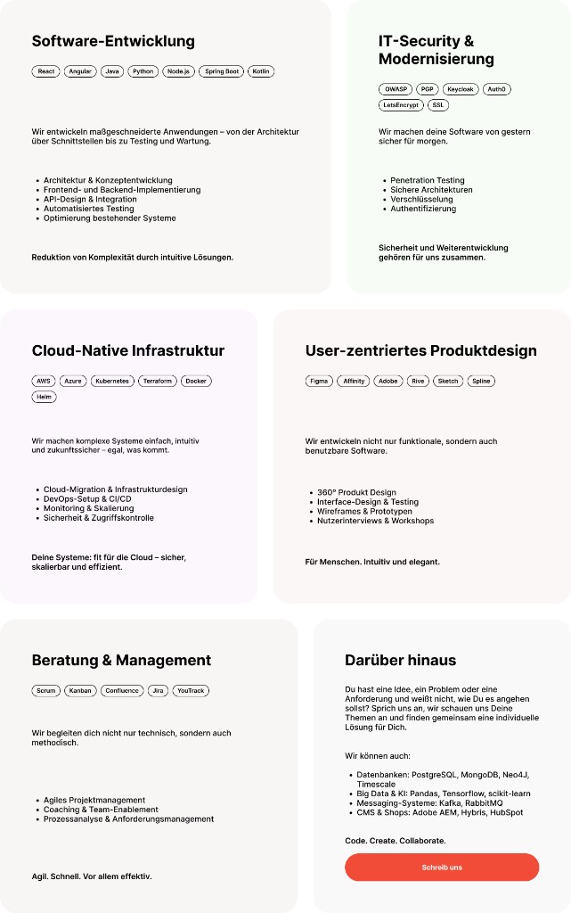
Services — from four icon columns to a scannable six-card grid.
By the time someone wanted to reach the team, phone, email, and social handles were still scattered across the old site.
One contact grid puts every outreach path on a single screen.
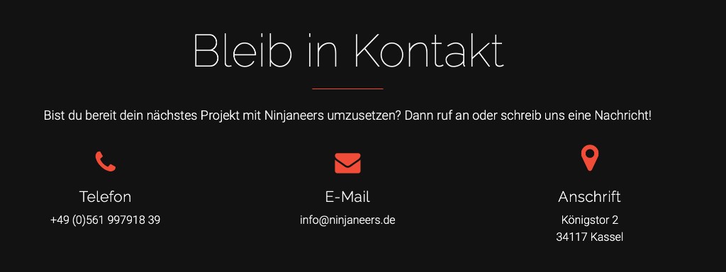
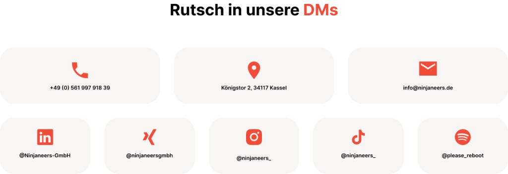
Contact — every outreach path on one screen.
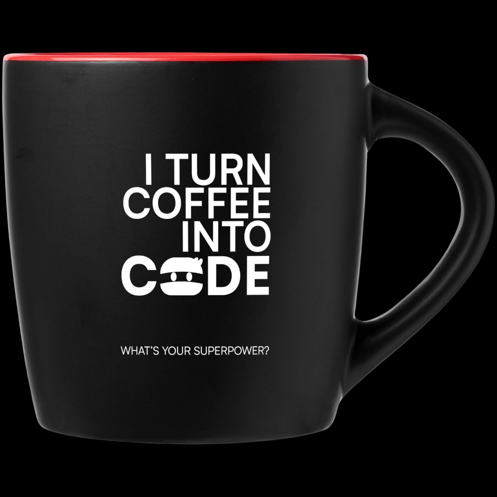
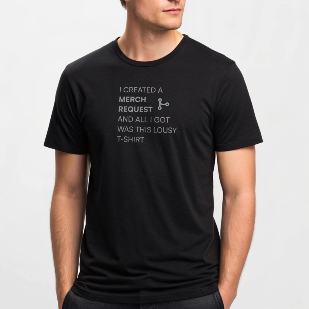
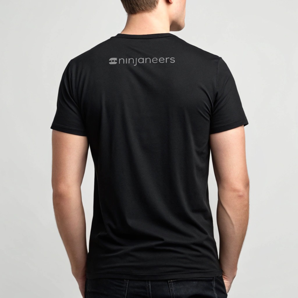
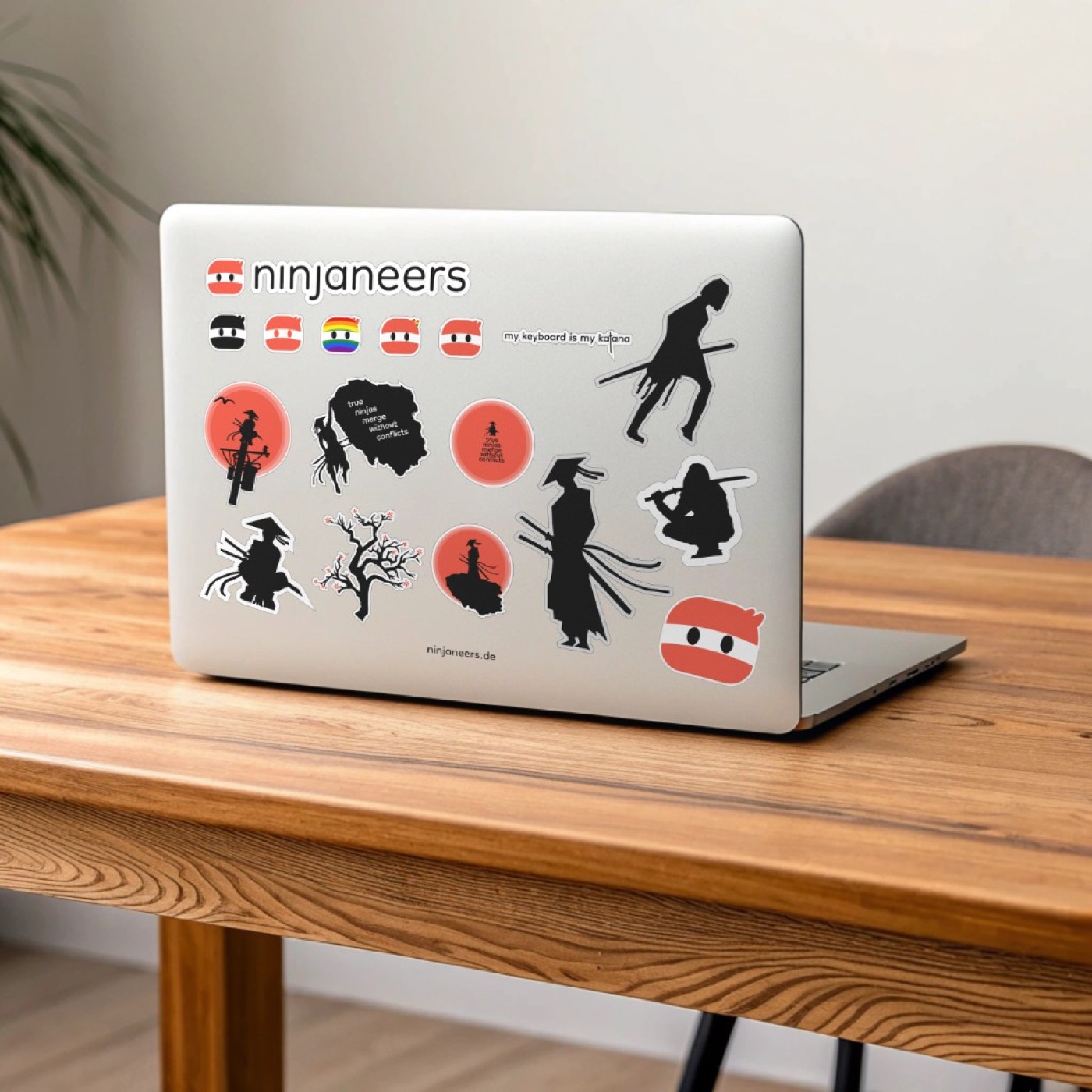
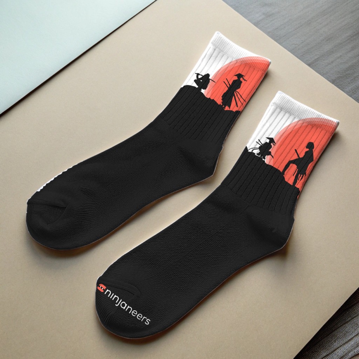
A rebrand only feels real once it leaves the screen — social profiles, employee touchpoints, and swag were still wearing the old look.
I rolled the identity out across social platforms, incentive cards, and custom merch — including socks from a manufacturer in Ukraine, with import logistics and EU customs handled myself.
05Reflection
The rebrand shipped with logo files, specs, and a site the team could extend without calling a designer for every new block.
A mentored student grew through the exploration alongside the identity itself — evolution in the mark, and in the people who helped shape it.