← Portfolio
Lectur.ly

Web App · 2025

Lectur.ly

Knowledge sharing made fun and easy.

Product ownershipEnd-to-end UXSaaSB2BDesign systemFigma

Outcome

Replaced a flaky Slack bot with a modern, responsive web app.

Lectur.ly gamifies internal learning: a colleague draws a random topic, gets one hour to prepare, then presents like an expert. I replaced a flaky Slack bot with a dedicated web app — Auditorium, Dashboard, Agenda, and Profile surfaces built on React and shadcn/ui.

Owned UX and product direction from user research through alpha-ready responsive mockups, with release surveys and prototype testing feeding straight into the backlog.

A product vision that reached alpha

A modern, responsive Lectur.ly replaced a flaky Slack bot — with dedicated surfaces for proposing topics, browsing past lectures, and reading the schedule at a glance. The platform reached internal alpha before development was paused.

When the bot is the whole product

Before Lectur.ly became a web app, the entire experience lived inside Slack: a chat bot for adding topics, assigning lecturers, and rating presentations. When it worked, it worked — but it was unreliable. Core actions failed without warning, and users lost confidence fast.

Navigation made it worse. The topics pool was nearly invisible — it was hard to tell which ideas were already queued. Scheduled talks were difficult to find. Summoning the interface meant typing `/lecturly` and hoping the bot responded. There was no archive of past sessions, and no convenient path to recordings except digging through the company drive or hunting for a calendar link.

Lectur.ly itself is a learning ritual: a colleague draws a random topic, gets one hour to prepare, then presents like an expert. The concept had traction. The delivery mechanism did not.

Validate first, build lean

I interviewed users and mapped the scope of the problem with the team. UX research and a review of comparable products shaped the direction before any high-fidelity work began.

Together with developers we chose React and shadcn/ui — then I defined the colour palette, design system, and component styles. The goal was clean and user-friendly with a "less is more" philosophy, but also developer-friendly: as many ready-made components as possible so the project stayed lean, shipped faster, and carried less risk for both UX and engineering.

User testing ran on early Figma prototypes and beta builds. Notes were summarised and carried into bug and task tickets. Online surveys after each beta release kept a pulse on progress and flagged what still needed work.

From slash command to dedicated surfaces

Each recurring job got its own screen — searchable, glanceable, and independent of Slack's mood that day.

Past lectures and their recordings were effectively lost — buried in shared drives or calendar links, if a link existed at all.

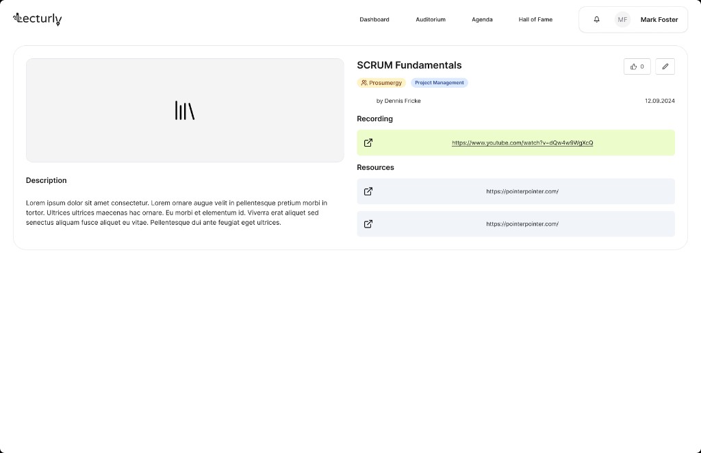
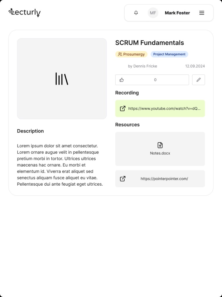
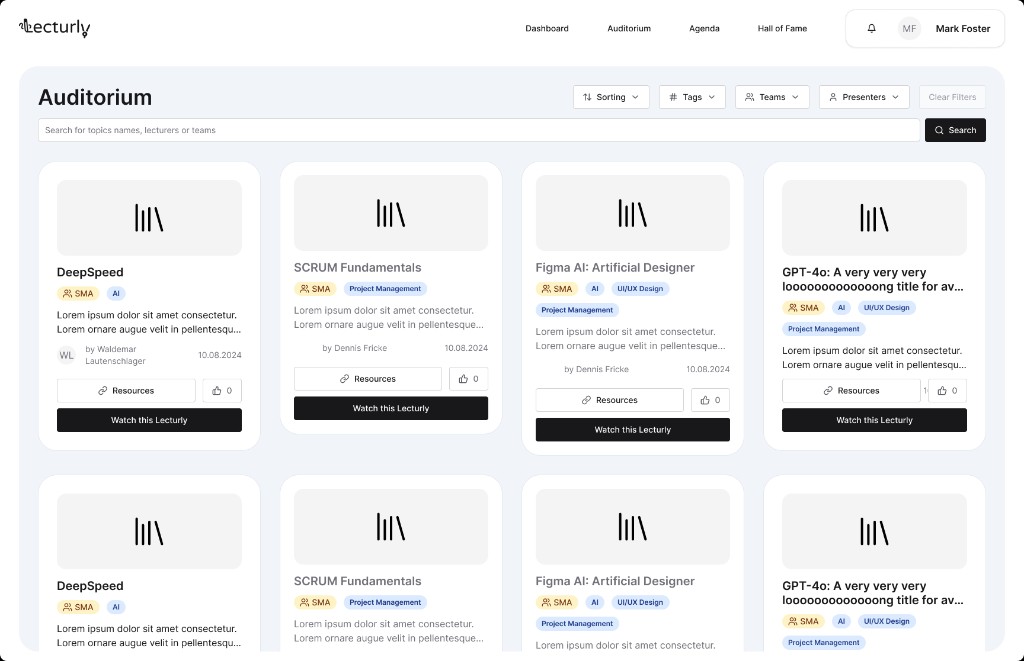
Design responseThe Auditorium catalogs every session with search, sorting, filters, and tags. Each lecture opens into a Full Detail view with a thumbnail, description, file links, resources, and the presentation recording in one place.

Lectur.ly — Every lecture, searchable

Auditorium — search and filter the full archive of past presentations.

Lectur.ly — One place for everything about a session

Full Detail view — description, recording, and resources on desktop.

Proposing a topic was awkward, and the topics pool was hard to read — users could not see what was already waiting to be drawn.

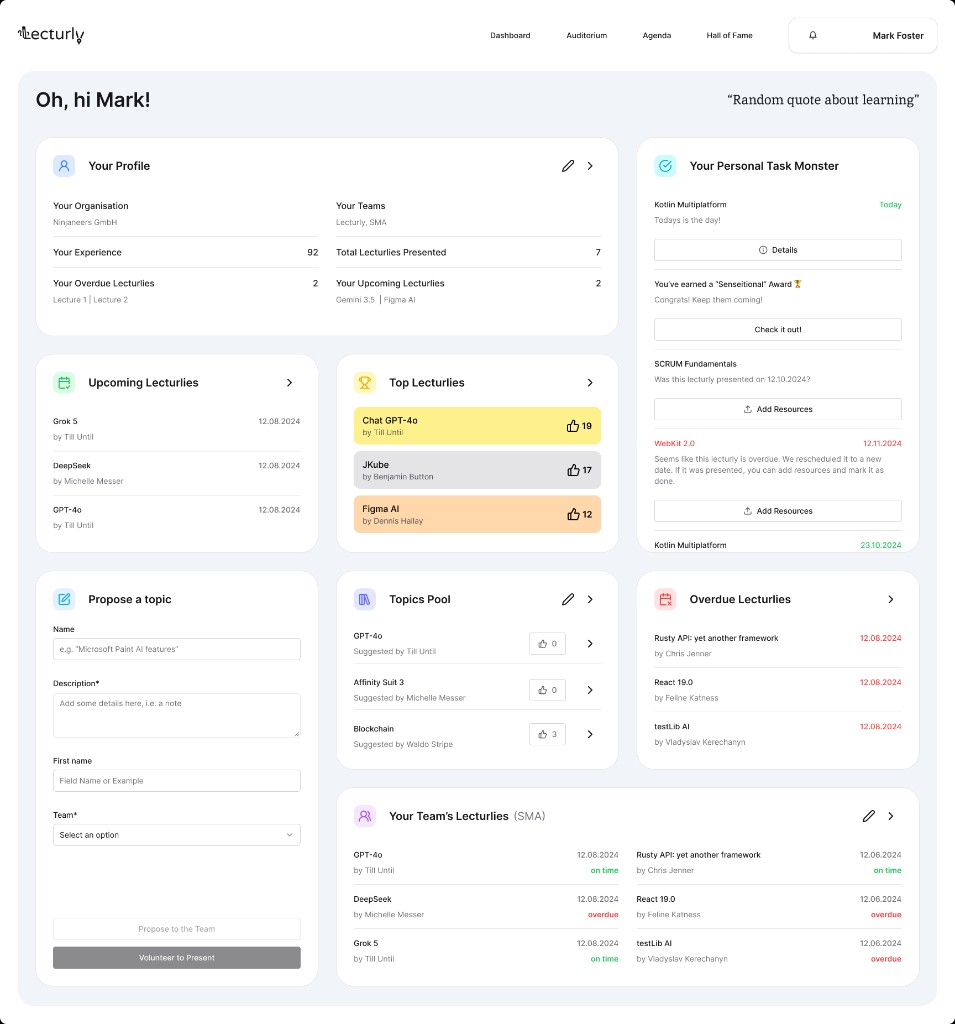
Design responseThe dashboard puts a Propose a Topic dashlet front and centre: name, description, and team in a few fields, no bot required. Upcoming sessions, overdue items, top lectures, and team activity sit in glanceable cards beside it.

Lectur.ly — A dashboard that answers at a glance

Dashboard — propose a topic, track sessions, and spot what needs attention.

Schedules lived in threads nobody could scan — what would be presented, when, and by whom stayed invisible.

Design responseAgenda makes the full schedule legible: titles, presenters, dates, and status in one filterable table — add a session to your calendar without digging through chat history.

Interactive Figma prototype — Agenda with filtering and add-to-calendar.

The old flow felt like admin work. Nothing rewarded participation or made the ritual fun.

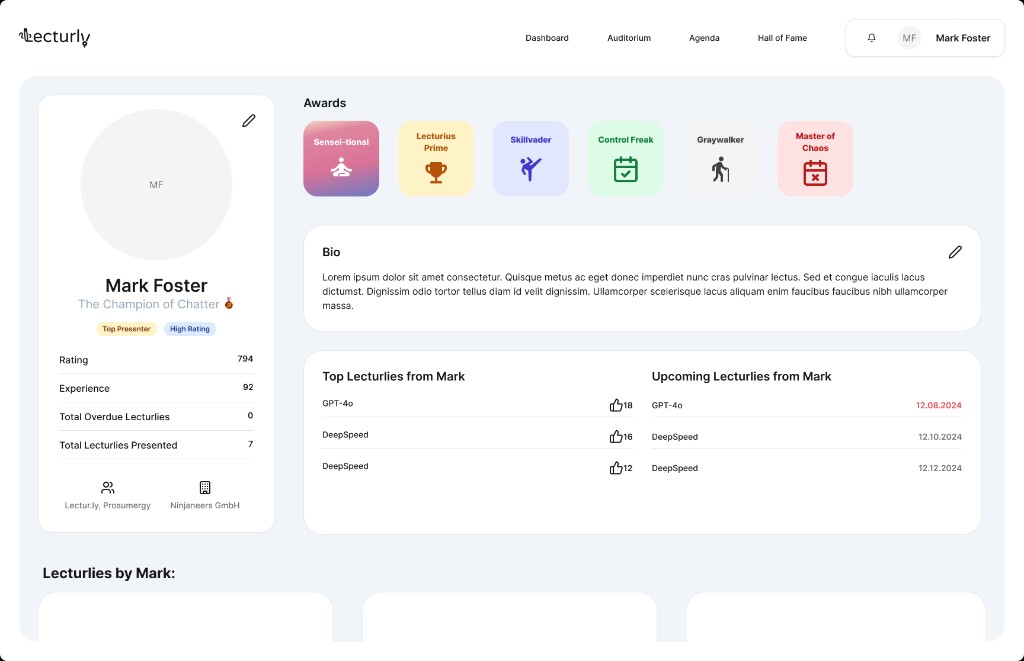
Design responseProfiles track experience points and silly awards — Sensei-tional, Lecturius Prime, Skillvader — to spark friendly competition. A dashlet surfaces the topics most likely to be drawn next, so presenters can prepare early.

Lectur.ly — Progress you can feel

Profile — experience points, awards, and lecture history.

Every flow, every breakpoint

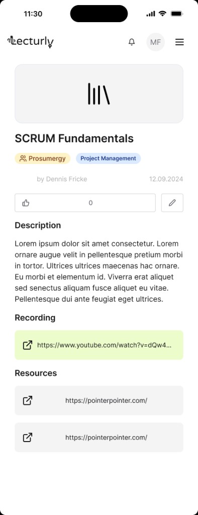
Core flows were prototyped for phone, tablet, and desktop with the same shadcn-based component library — built for a clean handoff to React.

Lectur.ly — Responsive across breakpoints 1
Lectur.ly — Responsive across breakpoints 2

Full Detail view on phone and tablet.

Paused, not wasted

Development paused after the internal alpha — but the product vision, design system, and flows remain ready to pick back up.

Methods

  • UX research
  • User surveys
  • Design systems
  • Wireframing
  • Prototyping
  • High-fidelity mockups
  • User stories
  • Branding
  • Product ownership